R Language –Presentation of Data : Online Course
R Histogram Graphs
- Histogram is a bar graph that shows the frequency of data within equal intervals.
- There is no space in between the bars.
- The area of each bar is proportional to the frequency that it represents. Hence, total area is proportional to the total frequency.
- Describes all the values in the range of two values in the histogram by its height.
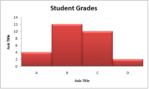
Example: Student Grades
Here is how many students got each grade in the recent test:
| A | B | C | D |
| 4 | 12 | 10 | 2 |
And here is the hologram chart:

Histograms in R
The ‘hist()’ function is used to create Histograms in R.
Syntax for hist() Function in R
| hist(x,main,xlab,ylab,breaks,xlim,ylim,col,border,freq) |
Following is the description of the parameters used
| S.No | Parameter | Description |
|---|---|---|
| 1. | vector/matrix | It is a vector or matrix which contains the numeric values. |
| 2. | xlab | It is the label for the x-axis. |
| 3. | ylab | It is the label for the y-axis. |
| 4. | main | It is the title of the chart. |
| 5. | col | It is used to give the color for both the points and lines |
| 6. | border | Optional. Here the border color name is given for the bars. |
| 7. | xlim | Optional. Here the limit of the x-axis is increased or decreased. By default this limit is set according to the bars. |
| 8. | ylim | Optional. Here the limit of the y-axis is increased or decreased. By default this limit is set according to the bars. |
| 9. | breaks | numeric or vector. The width of each bar is given |
Simple Example for histogram using Labels and Header in R
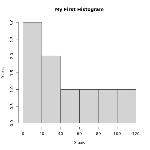
Input: To draw a simple Histogram graph out of this data using the hist() function. |
| vector = c(25,10,15,35,45,74,87,12,101) hist(vector, main = ‘My First Histogram’, xlab = ‘X-axis’, ylab = ‘Y-axis’) |
| Output: |
 |
Add border & fill color in R
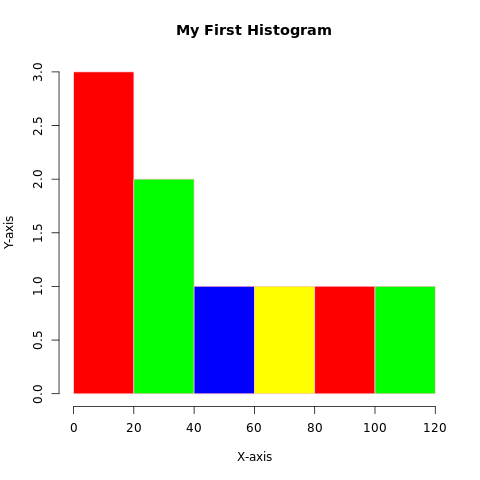
Input: To Add color to each Histogram with the col parameter and border color |
| vector = c(25,10,15,35,45,74,87,12,101) colors = c(‘red’,’green’,’blue’, ‘yellow’) hist(vector, main = ‘My First Histogram’, xlab = ‘X-axis’, ylab = ‘Y-axis’, border = ‘pink’, col = colors) |
| Output: |
 |
Example for hist() function with breaks parameter in R
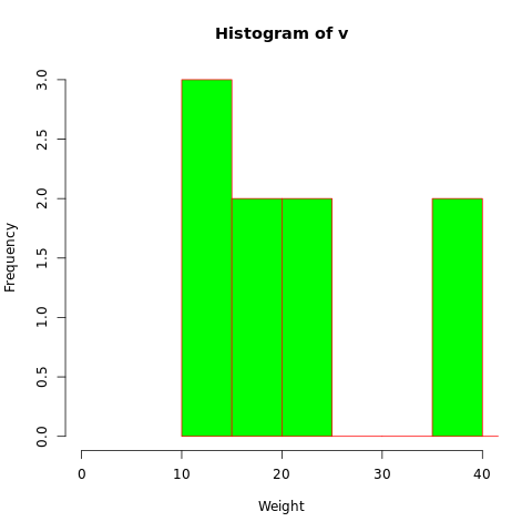
| Input: with the help of this parameter, the width of the bar has been increased. |
| #Creating data for the graph. v <- c(12,24,16,38,21,13,55,17,39,10,60) #Creating the histogram. hist(v,xlab = “Weight”,ylab=”Frequency”,col = “green”,border = “red”,xlim = c(0,40), ylim = c(0,3), breaks = 10) |
| Output: |
 |
