R Language –Presentation of Data : Online Course
R – Pie Charts
A circle graph shows the relationship between a whole and its parts. The whole circle is divided into sectors. The size of each sector is proportional to the activity or information it represents, is called pie chart. The total value of the pie is always 100 percent.
Here are the steps you can follow in order to determine the percentage on a Pie Chart:
- Data categorization
- Calculate the total based on the collected data.
- Divide the categories by the heads.
- Convert the numbers into percentages.
- And finally, convert the percentages into degrees.
Therefore, the Pie Chart formula is given as
(Given Data/Total value of Data) × 360°
Example: Student Grades
Here is how many students got each grade in the recent test:
| A | B | C | D |
| 4 | 12 | 10 | 2 |
And here is the pie chart:
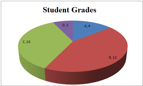
In R, Pie chart is drawn using the pie() function in R programming . This function takes in a vector of non-negative(positive) numbers. Additional parameters are used to control labels, colors, titles, etc.
There is the following syntax of the pie() function:
| pie(X, Labels, Radius, Main, Col, Clockwise) |
Following is the description of the parameters used
| S.No | Parameter | Description |
|---|---|---|
| 1. | x | It is a vector or matrix which contains the numeric values. |
| 2. | labels | it is used to give description to the slices. |
| 3. | radius | This is the radius of the circle whose value is between -1 and 1 |
| 4. | clockwise | It is a Boolean value indicating if slices drew in the clockwise direction or counter-clockwise direction. By default, it is counter-clockwise |
| 5. | main | It is the title of the chart. |
| 6. | col | indicates the color palette |
| 7 | border | Here the border color name is given |
| 8 | lty | lty is the text sequence of four numbers from 1 to 9, for example: lty = “4241”. |
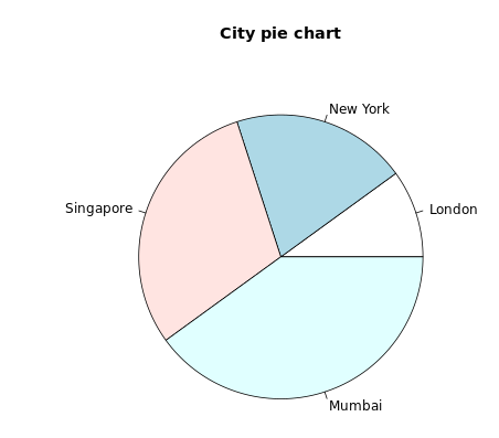
Simple Example for pie() Function using Labels and Header in R
Input: To draw a simple pie chart out of this data using the pie() function. |
| #Create a vector of pies x <- c(10,20,30,40) labels <- c(“London”, “New York”, “Singapore”, “Mumbai”) #Display the pie chart with Labels and Header pie(x, labels, main = “City pie chart”) |
| Output: |
 |
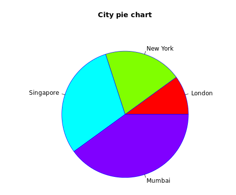
Add border & fill color in R
Input: To Add color to each pie with the col parameter and border color |
| #Create a vector of pies x <- c(10,20,30,40) labels <- c(“London”, “New York”, “Singapore”, “Mumbai”) #Display the pie chart with Labels and Header pie(x, labels, main = “City pie chart”, col = rainbow(length(x)), border = ‘blue’) |
| Output: |
 |
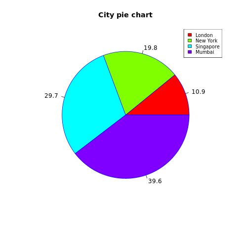
Slice Percentages and Chart Legend
We can add slice percentage and a chart legend by creating additional chart variables. There is the following syntax of the legend() function.
| legend(x,y=NULL,legend,fill,col,bg) |
Here,
- x and y are the coordinates to be used to position the legend.
- legend is the text of legend
- fill is the color to use for filling the boxes beside the legend text.
- col defines the color of line and points besides the legend text.
- bg is the background color for the legend box.
| Input: To draw Slice Percentages and Chart Legend |
| #Create a vector of pies x <- c(11,20,30,40) labels <- c(“London”, “New York”, “Singapore”, “Mumbai”) piepercent<- round(100*x/sum(x), 1) #Display the pie chart with Labels and Header pie(x, labels = piepercent, main = “City pie chart”, col = rainbow(length(x)), border = ‘blue’) legend(“topright”, c(“London”,”New York”,”Singapore”,”Mumbai”), cex = 0.8, fill = rainbow(length(x))) |
| Output |
 |
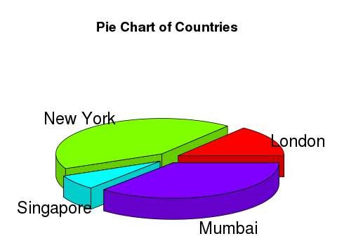
Create 3D pie chart in R
A pie chart with 3 dimensions can be drawn using additional packages. The package plotrix has a function called pie3D() that is used for this.
For plotrix package installation : RGui > Packages > Install package(s)… > Select Plotrix and wait for some seconds
Custom Installation : go to https://cran.r-project.org/web/packages/plotrix/index.html and download plotrix package > RGui > Packages > Install package(s) from local zip files… > Open downloaded plotrix Zip file.
| Input: to Create 3D pie chart in R |
| #Create a vector of pies library(plotrix) x <- c(21, 62, 10,53) lbl <- c(“London”,”New York”,”Singapore”,”Mumbai”) # Plot the chart. pie3D(x,labelslabels = labels,explode = 0.1, main = “Country Pie Chart”) |
| Output: |
 |
