R Language –Presentation of Data : Online Course
R Bar Graphs
A Bar graph is a pictorial representation of The numerical data By a number of Bars of uniform width erected horizontally or vertically with equally spacing between them.
Bar Graph rules
A good bar graph should have:
- A clear and accurate title that explains the purpose of the graph
- Bars that are either labelled directly or indicated by means of a color key
- An X and Y axis that are labelled
- Bars should not be touching one another.The source of the data.
Which Bar Graphs do you think are the best here?
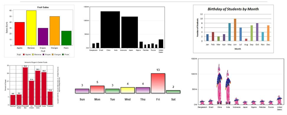
In R, we can create a bar chart to visualize the data in an efficient manner. For this purpose, R provides the barplot() function.
Note: barplot() This function also takes negative numbers in the vector.
Syntax for R Bar Chart(barplot())
| barplot(vector/matrix, names.arg, xlab, ylab, main, horiz, col, border, beside, xlim, ylim) |
Following arguments in details.
| S.No | Parameter | Description |
|---|---|---|
| 1. | vector/matrix | It is a vector or matrix which contains the numeric values. |
| 2. | names.arg | A vector of names that appear under each bar. |
| 3. | xlab | It is the label for the x-axis. |
| 4. | ylab | It is the label for the y-axis. |
| 5. | main | It is the title of the chart. |
| 6. | col | It is used to give the color for both the points and lines |
| 7 | horiz | Optional. If you want the bar horizontal, then ‘TRUE’ is given here. |
| 8 | border | Optional. Here the border color name is given for the bars. |
| 9 | beside | Optional. If its value is given TRUE then grouped bar chart is displayed, if it is FALSE then stacked bar chart is displayed. |
| 10 | xlim | Optional. Here the limit of the x-axis is increased or decreased. By default this limit is set according to the bars. |
| 11 | ylim | Optional. Here the limit of the y-axis is increased or decreased. By default this limit is set according to the bars. |
Simple Example for barplot() Function in R
| Input: Simple Example for barplot() Function in R |
| vec = c(25,10,15,35,5) barplot(vec) |
| Output |
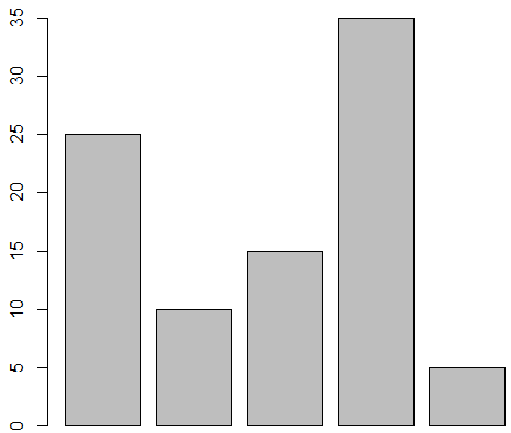 |
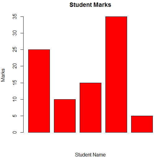
Add Title , color and Labels on Bar in R
| Input: To draw a bar chart using parameter main, col, xlab and ylab |
| vec = c(25,10,15,35,5) barplot(vec, xlab=’Student Name’, ylab=’Marks’, main=’Student Marks’, col=’red’) |
| Output: |
 |
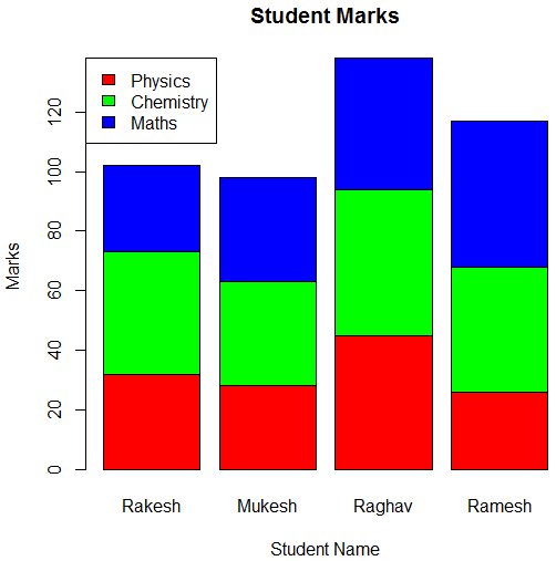
Create Stacked Bar Chart using Matrix in R
For example, a stacked bar chart has been created. It is very important to have legend in this bar chart, along with this matrix is used. The legend() function is used to create the legend.
| Input: To draw Stacked Bar Chart using Matrix |
| col = c(“red”,”green”,”blue”) stud_name = c(“Rakesh”,”Mukesh”,”Raghav”,”Ramesh”) sub = c(“Physics”,”Chemistry”,”Maths”) # Create the matrix of the values. marks = matrix(c(32,28,45,26,41,35,49,42,29,35,44,49),nrow = 3,ncol = 4,byrow = TRUE) barplot(marks, main=”Student Marks”, names.arg=stud_name, xlab=”Student Name”, ylab=”Marks”, col = col) #legend for stacked bar chart. legend(“topleft”, sub, fill = col) |
| output: |
 |
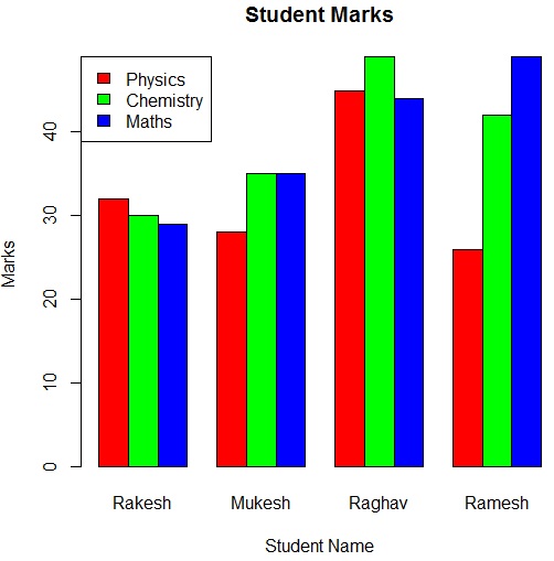
Create Grouped Bar Chart using Matrix in R
For example, a grouped bar chart has been displayed with the help of the parameter of this barplot() function.
| Input: To draw Grouped Bar Chart using Matrix |
| col = c(“red”,”green”,”blue”) stud_name = c(“Rakesh”,”Mukesh”,”Raghav”,”Ramesh”) sub = c(“Physics”,”Chemistry”,”Maths”) # Create the matrix of the values. marks = matrix(c(32,28,45,26,30,35,49,42,29,35,44,49), nrow = 3, ncol = 4, byrow = TRUE) barplot(marks, main=”Student Marks”, names.arg=stud_name, xlab=”Student Name”, ylab=”Marks”, col = col, beside=TRUE) #legend for grouped bar chart. legend(“topleft”, sub, fill = col) |
| output: |
 |
