R Language –Presentation of Data : Online Course
R Scatter Plot
- The scatter plots are used to compare variables.
- Comparison between variables is meant to define how much one variable is affected by another variable.
- In a scatter plot, the data is represented as a collection of points and plots one point for each observation..
- Each point on the scatter plot defines the values of the two variables.
- One variable is selected for the vertical axis and other for the horizontal axis.
- The simple scatter plot is created using the plot() function.
There is the following syntax for creating scatter plot in R:
Plot(x,y,…) |
And its complete syntax is:
plot(x, y, type, main, sub, xlab, ylab) |
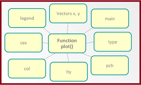
Some arguments of the plot() function:
Following arguments in details.

| S.NO | PARAMETER | DESCRIPTION |
|---|---|---|
| 1. | v | It is a vector which contains the numeric values. x is specifies points on the x-axis. y is specifies points on the y-axis. |
| 2. | type | change the plot type. It accepts the following strings and has the given effect.”p” – points “l” – lines “b” – both points and lines “c” – empty points joined by lines “o” – overplotted points and lines “s” and “S” – stair steps “h” – histogram-like vertical lines “n” – does not produce any points or lines |
| 3. | xlab | It is the label for the x-axis. |
| 4. | ylab | It is the label for the y-axis. |
| 5. | main | It is the title of the chart. |
| 6. | col | It is used to give the color for both the points and lines |
| 7 | pch | pch is used to change the point shape format. |
| 8 | cex | Use cex=number to change the size of the points |
| 9 | Legend() | Legend takes as input the coordinates, text and the symbols to be interpreted. |
| 10 | Ity | lty is the text sequence of four numbers from 1 to 9, for example: lty = “4241”. |
