R Language –Presentation of Data : Online Course
R Language –Presentation of Data : Online Course: So many programming language are available but R language is used for specific Statistical Computing and Data Analysis. In this article, Study the different types of charts & Graphs in R programming. We will also understand the concept and implementation with the help of examples.
In Data Analysis and statistics, Tables, charts, and graphs are often used to communicate data visually. They allow users to quickly identify trends, examine clear data, and see a real picture. This power and appeal make a “picture worth a thousand words”. In business presentation, charts, graphs, and tables can be used to represent data, illustrate important patterns or relationships, and observe changes as the data changes.
Data
Data is any information in raw or organized form using alphabets , numbers or symbols that refers to or represents preferences, ideas, objects, traits, categories etc.
Definition: Data
A collection of facts, such as numbers, words, measurements, observations or even just descriptions of things.
Information
- Raw data carry/convey little meaning, when it is considered alone.
- The data is minimized, processed/analyzed and then presented systematically. So that it is converted into Information.
- It is important to note that data, which is not converted into information, is of little value for evaluation and planning and cannot be used by those involved in decision making.
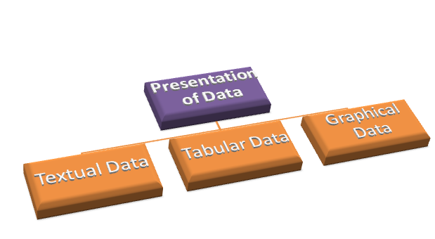
Presentation of Data
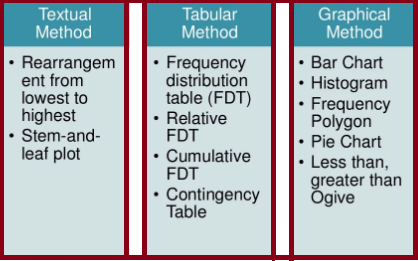
Method by which the people organize, summarize and communicate information using a variety of tools such as textual, tabular and graphical.


Textual Presentation of Data
Data can be presented using paragraphs or sentences. It involves enumerating important characteristics, emphasizing significant figures and identifying important features of data.
Example : In the Statistics class of 40 students, 3 obtained the perfect score of 50. Sixteen students got a score of 40 and above, while only 3 got 19 and below. Generally, the students performed well in the test with 23 or 70% getting a passing score of 38 and above.
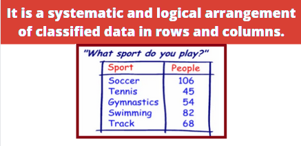
Tabular Presentation of Data

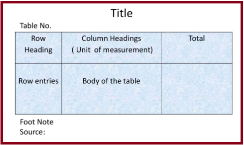
General principals of designing tables

- The tables should be numbered e.g table 1, table 2 etc.
- A title must be given to each table, which should be brief and self explanatory.
- The headings of columns or rows should be clear and concise.
- The data must be presented according to size or importance chronologically, alphabetically, or geographically.
- If percentages or averages are to be compared, they should be placed as close as possible.
- No table should be too large
- Most of the people find a vertical arrangement better than a horizontal one because, it is easier to scan the data from top to bottom than from left to right
- Foot notes may be given, where necessary, providing explanatory notes or additional information.
Charts & Graphs
Reasons to create charts and graphs:
- Provide a visual representation of data.
- Effectively clarify information.
- Represent many different types of data.
- Make important trends easily recognizable.
- Allow users to perceive information quickly.
- Aid data interpretation. Reasons to create charts and graphs
- …Charts and graphs can be incorporated into any medium like _
- Reports
- Web Pages
- Posters
- Word Processing Document
- Desktop Publishing Document
